ASO Screenshots: App Store & Google Play Guide
Learn how to plan ASO screenshots that make your app easier to understand, from the first-frame promise to platform specs, localization, and meaningful testing.
ASO screenshots are the visual argument for installing your app. Your title, subtitle, description, and keyword fields help the right people find the listing; the screenshot sequence helps them understand what they get and whether the product is worth their time.
That distinction matters. ASO is not only about ranking for a keyword. It is also about making the listing relevant, credible, and easy to choose once a person sees it. In other words, ASO in screenshots means turning real product screens into a short, readable story about the user's outcome.
This guide shows how to plan that story for the Apple App Store and Google Play, with current platform checks, copy rules, localization advice, and a testing workflow you can use with WowShots.
The short answer: what makes an ASO screenshot work?
A strong screenshot does three jobs quickly:
- It names one outcome the target user wants.
- It shows enough real app UI to make that outcome believable.
- It stays readable when the store displays the image at a small preview size.
The first three frames deserve the most planning because many visitors make an early decision about whether the app is relevant. Do not make the visitor decode a logo, a generic slogan, or a crowded feature list before they see the product's value.
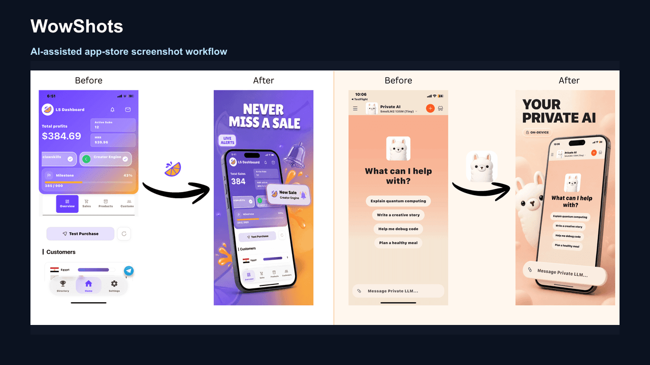
ASO screenshots are more than raw app captures
A raw screen documents the interface. An ASO screenshot explains why the interface matters.
The most useful transformation is not adding more decoration. It is adding hierarchy:
- a short benefit-led headline;
- a clear crop of the relevant app state;
- enough context to show the workflow is real;
- a visual system that makes the set feel connected; and
- a message that matches the audience, market, and store surface.
There is no single screenshot layout that guarantees a ranking increase or a conversion lift. Treat every creative decision as a hypothesis. Your evidence should come from product-page views, downloads, conversion, source, territory, and the experiment tools available for your store.
Build the first three screenshots as a decision story
Before choosing a gradient or a phone frame, write the job for each of your first three screenshots.
Screenshot 1: Make the value obvious
Lead with the clearest user outcome. Replace a feature label like “Smart dashboard” with a benefit such as “See which campaigns drive installs.” The headline should be specific enough for the right visitor to recognize themselves and short enough to read at thumbnail size.
Screenshot 2: Prove the promise
Show the product state that makes the first claim credible. If the first frame promises faster planning, the second might show the plan being created, edited, or shared. Keep the UI large enough to inspect; a beautiful device frame is not useful if it turns the product into a tiny rectangle.
Screenshot 3: Explain the difference
Use the third frame to answer the next question a visitor has: what makes this app worth choosing? Show a distinctive workflow, a useful result, a control that reduces effort, or another truthful reason to continue through the gallery.
A simple first-three sequence is:
| Frame | Question it answers | Screenshot job |
|---|---|---|
| 1 | Why should I care? | Lead with the strongest outcome |
| 2 | Can I believe it? | Show real UI proof |
| 3 | Why this app? | Demonstrate the differentiator |
If two frames make the same claim, combine them or replace one. A coherent three-frame story is more useful than filling every slot with near-duplicates.
An eight-frame ASO screenshot sequence you can adapt
You do not need eight screenshots for every app. Use this as a planning framework, then keep the frames that add new information.
- Hook: Name the problem, desire, or moment the app is for.
- Promise: Show the specific result the user gets.
- Hero feature: Prove the fastest or most valuable part of the workflow.
- Trust: Reduce risk with accurate product proof, control, privacy, or support cues that are genuinely true.
- How it works: Show the few steps from input to result.
- Secondary value: Add one useful feature or use case for a different intent.
- Objection handler: Address setup effort, compatibility, importing data, or another real hesitation.
- Close: Remind the visitor of the benefit without turning the screenshot into a pushy install ad.
Write a one-line brief for every frame before design. For example: “A founder sees the app can turn raw screens into a polished store set.” The brief keeps the UI, headline, and crop working toward the same idea.
Five design rules for screenshots that convert
1. One screenshot, one idea
The more claims you add, the harder it is to know what the visitor should remember. Give each frame one primary message. Secondary details can live in the UI or the next frame.
2. Write benefits, not category labels
Feature labels make the visitor do the translation. Benefit-led copy does that work for them.
| Feature label | Benefit-led alternative |
|---|---|
| Recipe library | Save every recipe you find |
| Analytics dashboard | See which campaigns drive installs |
| AI editor | Turn a rough image into a polished asset |
| Trip planner | Build a day-by-day plan in minutes |
Keep the wording concrete. “Powerful,” “seamless,” and “all-in-one” are difficult to believe unless the screenshot proves exactly what they mean.
3. Show real UI at a useful scale
Use current app screens with realistic, non-sensitive sample data. Crop toward the decision-relevant area, but do not fabricate functionality or show a state the shipped product cannot deliver. If supporting artwork is helpful, let it frame the product rather than hide it.
4. Design for a two-second scan
Check each screenshot at the same size a store visitor will see. The headline should win the first glance, then the UI should explain or prove it. Use strong contrast, generous safe margins, and a small number of type styles. If the headline needs zooming, shorten it or increase its size.
5. Keep the set consistent, not repetitive
Define the headline area, device scale, background roles, spacing, and accent colors once. Then vary the composition only when the story needs it. A connected background can encourage a swipe, but a repeated phone angle and repeated message can make every frame feel interchangeable.
Apple App Store screenshot requirements
Always verify the exact target in App Store Connect before exporting. Apple currently allows one to ten screenshots per screenshot set in JPEG, JPG, or PNG format, and the files cannot include alpha channels or transparency. See the current Apple screenshot specifications for the complete device matrix.
Common current iPhone targets include:
| Display target | Portrait examples |
|---|---|
| 6.9-inch | 1260 × 2736, 1290 × 2796, or 1320 × 2868 |
| 6.5-inch | 1284 × 2778 or 1242 × 2688 |
| 6.3-inch | 1179 × 2556 or 1206 × 2622 |
| 6.1-inch | 1170 × 2532, 1125 × 2436, or 1080 × 2340 |
| 5.5-inch | 1242 × 2208 |
If the app runs on iPad, plan the iPad set as well. Apple lists large iPad targets such as 2064 × 2752 and 2048 × 2732 in the same reference. When the UI is the same across device sizes and localizations, Apple explains that the highest-resolution screenshots can scale down to smaller sizes; still confirm which assets App Store Connect requests for your app.
App previews are optional, but when provided they appear before screenshots on supported Apple product pages. Read Apple's upload guidance before making a video part of the story.
Google Play screenshot requirements
Google Play supports up to eight screenshots for each supported device type. To publish a store listing, Google requires at least two screenshots across different device types, using JPEG or 24-bit PNG without alpha. The minimum dimension is 320 pixels, the maximum is 3840 pixels, and the longest dimension cannot be more than twice the shortest.
For apps that want to be eligible for recommendation surfaces that use screenshots, Google recommends at least four screenshots at 1080 pixels or larger, using 9:16 portrait or 16:9 landscape proportions. A practical phone starting point is 1080 × 1920 portrait, but confirm the device-specific requirements in the Google Play preview asset guidance.
Google also says screenshots should demonstrate the actual in-app experience. Keep taglines restrained and under 20% of the image when you use them, and avoid claims about rankings, awards, testimonials, prices, promotions, or Google Play performance. These rules are especially important when the screenshots may appear in recommendation surfaces.
If your listing includes a preview video, screenshots can appear after it. Make the poster frame and first screenshot feel like one story so the visitor does not see a disconnected promise before the product UI.
Keyword strategy: use ASO language without stuffing the artwork
Use keyword research to understand the visitor's intent, then express that intent in plain language. A screenshot headline is not a replacement for the App Store metadata fields or Google Play description. Its job is to help the visitor recognize the outcome.
For every target keyword, ask:
- What problem is the searcher trying to solve?
- What result would make the app relevant in two seconds?
- Which real UI state proves that result?
- Does the landing listing, headline, and screenshot sequence make the same promise?
For example, a search for “app screenshot generator” may signal a need for speed, store-ready sizes, or better design. Do not repeat the keyword unnaturally in every frame. Build a sequence around the underlying job: upload raw screens, create a clear visual story, review the output, and export the correct assets.
Localization is a creative pass, not a copy-and-paste task
Translating the English headline is only the first step. A localized screenshot set may need:
- different line breaks and text sizes;
- local examples, dates, names, currencies, and imagery;
- product UI in the target language;
- a different crop or frame order for local intent; and
- right-to-left layout checks for languages such as Arabic and Hebrew.
Review the rendered images, not only the translated strings. A linguistically correct headline can still collide with a phone frame, overflow a safe area, or lose contrast on a new background. Start with the markets that already have meaningful traffic or a clear expansion case, then measure those variants separately.
Test a hypothesis, not a decoration
When your store supports experiments, change a strategic message first. Useful tests include:
- outcome-led first frame versus feature-led first frame;
- one screenshot order versus another;
- a hero workflow versus a result screen;
- audience-specific copy for a priority segment; and
- localized creative versus the default English set.
Write down the hypothesis before you publish the variant. Change the smallest set of assets needed to express it, choose a primary metric, and record the creative version alongside the test dates. Use Apple Product Page Optimization and Google Play Store Listing Experiments to understand the current testing options for each platform.
Do not call a color preference a winner before you have enough evidence. Track impressions, product-page views, downloads, conversion, territory, source, and—when possible—downstream activation or purchase quality. A screenshot set can improve conversion for one audience while making another audience less relevant.
A practical pre-publish checklist
Before you export an ASO screenshot set, ask:
- Does the first screenshot state a specific outcome?
- Do the first three frames work as a group without requiring a long description?
- Does every headline fit at thumbnail size?
- Does the UI visibly support the claim?
- Does each frame add a distinct reason to continue?
- Are the device, orientation, format, and dimensions correct for the platform?
- Have you removed private data, stale UI, unsupported claims, and unlicensed logos?
- Does every priority localization still fit and read naturally?
- Is the source file editable for the next update or test?
- Do you know which metric will tell you whether the new set helped?
How WowShots fits into the workflow
WowShots is built for the gap between raw product screens and store-ready creative. Start by pasting an App Store or Google Play link, or upload your own screenshots. The workflow can use the app context and source screens to draft a coordinated set with benefit-led copy and platform-specific output.
Use the result as a fast first draft, then review every headline, claim, crop, localization, and export dimension against the current product and store rules. When you already have a finished design and only need a correctly sized file, use the App Screenshot Resizer. For inspiration before you storyboard, browse the free App Store screenshot examples.
FAQ
What are ASO screenshots?
ASO screenshots are app store images designed to explain an app's value and support the install decision. They combine real product UI with concise, readable messaging and a sequence that matches the audience's questions.
Do screenshots improve app store rankings?
Screenshots are primarily a conversion and communication surface. Store ranking depends on many signals that Apple and Google do not reduce to one public formula. Use screenshots to improve relevance and conversion, and test any ranking or download effect with your own listing data.
How many screenshots should I use?
Use enough frames to explain the product without repeating yourself. Apple allows one to ten screenshots per set, while Google Play allows up to eight per supported device type. The right number is the smallest set that answers the visitor's main questions clearly.
Should I make separate App Store and Google Play screenshots?
Usually, yes. The core story can be shared, but the platform limits, device targets, media order, recommendation surfaces, and content guidance differ. Export and review a version for each store.
What should the first screenshot say?
It should name the clearest outcome for the target audience and show believable UI proof. “Know what you can spend before payday” is more useful than “Smart budget dashboard” because it tells the visitor what changes for them.
What is the fastest way to create a first draft?
Write the first-three story, collect clean product screens, and use WowShots to generate a coordinated starting point. Keep a human review step for product accuracy, accessibility, localization, and store compliance.
Sources and next steps
- Apple screenshot specifications
- Apple upload app previews and screenshots guidance
- Google Play preview asset guidance
- Apple Product Page Optimization
- Google Play Store Listing Experiments
Once the story is clear, create your screenshot set with WowShots →
Useful WowShots tools
Move from research to production with the tool that matches your next step.